2025
BusMate App
Revolutionizing Bus Transportation in Sri Lanka
Project overview
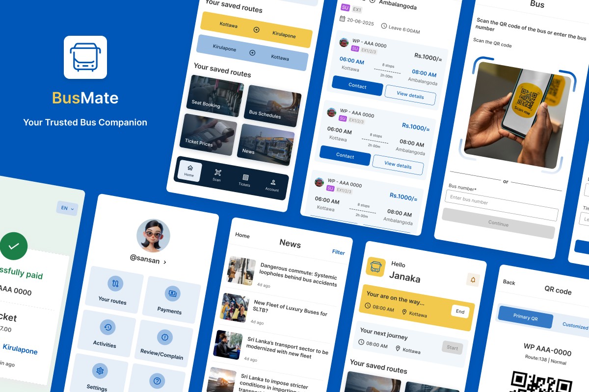
BusMate is a comprehensive mobile app solution designed to modernize bus transport in Sri Lanka. It caters to three distinct user groups: passengers, bus drivers/conductors, and bus owners, offering features such as payments, seat booking, timetables, complaints, and earnings tracking. The app aims to make public transport more accessible, transparent, and efficient.
Problem Statement/Challenge
Sri Lanka's bus transportation system, while extensive, faces several challenges that impact efficiency, convenience, and user satisfaction across all stakeholders:
For Passengers
Cash-only payments & change issues:
Passengers frequently face issues with cash-only transactions, including not receiving correct change and the widespread practice of conductors not issuing tickets, which is legally required.
Lack of reliable route information:
Difficulty in accessing accurate bus routes, timetables, and real-time bus availability, as existing digital maps (like Google Maps) are often outdated or incomplete for local bus networks.
No seat booking:
Inability to book bus seats in advance leads to uncertainty and discomfort, especially on long-distance routes.
Poor service & complaints:
Limited awareness for passengers to report issues or complain about driver/conductor behavior.
For Drivers/Conductors
Inefficient operations:
Manual ticket issuance and cash handling are time-consuming and prone to errors.
For Bus Owners
Revenue leakage & lack of transparency:
Absence of a robust system to track actual earnings, leading to potential money misappropriation by employees.
Limited oversight:
Challenges in monitoring fleet performance, managing routes, and ensuring service standards.
Absence of performance metrics:
Difficulty in accessing comprehensive statistics and analytics for informed decision-making.
Target audience
Passengers: Daily commuters, occasional travelers, tourists
Bus Drivers/Conductors: Professionals responsible for operating buses, collecting fares, and ensuring smooth journeys.
Bus Owners: Individuals or companies managing bus fleets, focused on operational efficiency and profitability.
Goal
To design an inclusive, user-friendly app that streamlines payments, improves information access, and empowers all user groups.
Design process & approach
This project followed a user-centered design approach by leveraging established UX principles and common user behaviors observed during travel and community interactions. The process was iterative, moving from understanding the problem space to conceptualizing solutions and refining the visual design.
Problem Definition & Assumption Gathering:
Based on the identified pain points, I defined the core problems to solve. I made assumptions about user needs and preferences based on general knowledge of commuters, conductors, and owners, situations observed during travels, news and reports.
User Personas
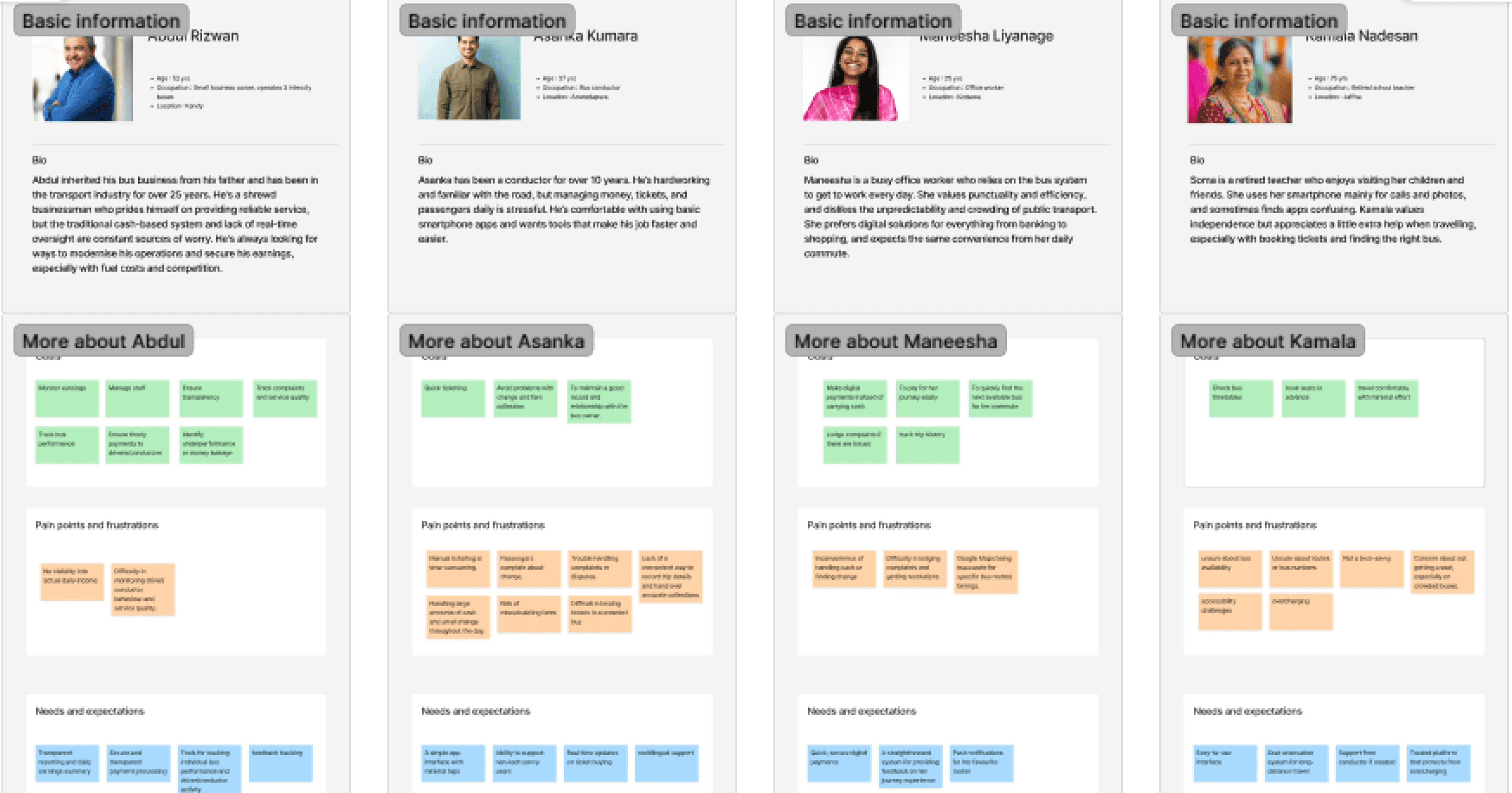
Developed four personas to guide design: Mr. Abdul Rizwan (Bus Owner), Mr. Asanka Kumara (Conductor), Ms. Maneesha Liyanage (Daily Commuter), and Ms. Kamala Nadesan (Elderly Traveler). These personas, inspired by observed behaviors and conversations, shaped features like favourite routes, seat booking, customized QR, schedules, payment history, language selector.
User personas
Competitive Analysis & Best Practices Review
Noted the absence of competitors or existing systems addressing bus management and passenger needs, relying instead on travel observations and news insights. Drew upon established UX/UI best practices for accessibility, navigation (e.g., bottom navigation bars), and interactive elements to ensure an intuitive design, adapting them to the unique Sri Lankan bus context.
Information Architecture & User Flows
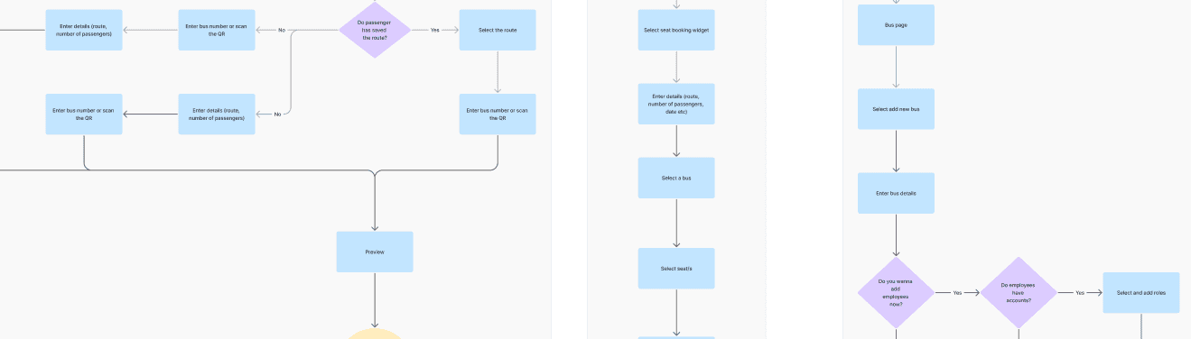
Structured the content logically, defining key sections for passenger, conductor, and owner accounts. Mapped out essential user flows, to ensure a smooth and logical user journey.
User flows
Wireframing & Low-Fidelity Prototyping
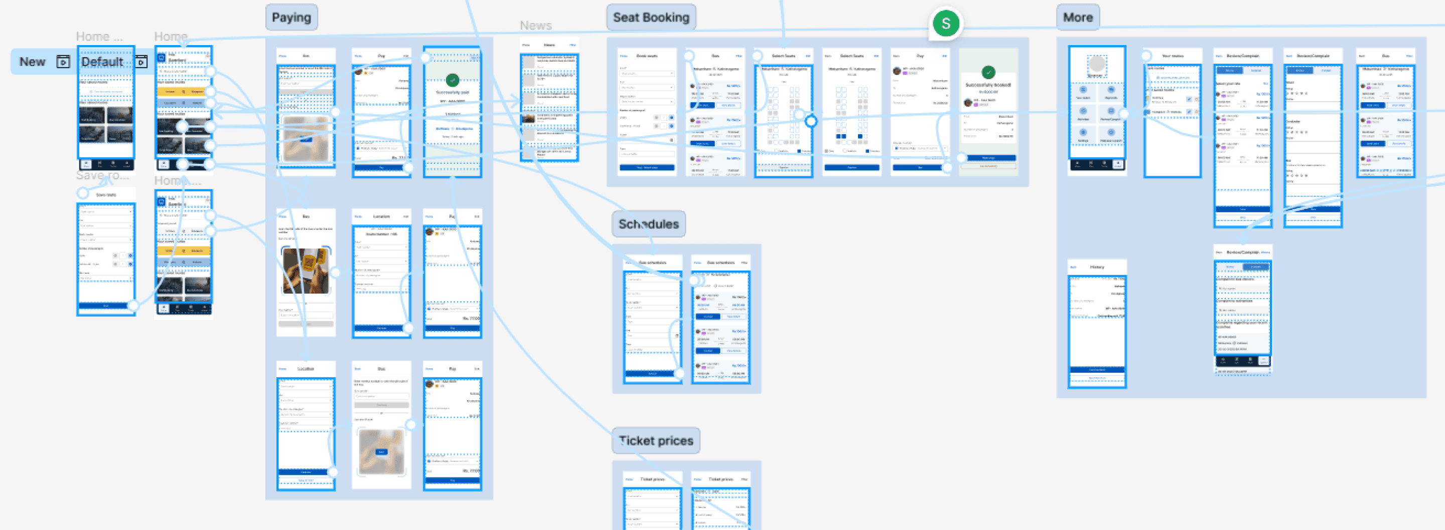
Began by sketching basic layouts and structures for key screens during travel, focusing on content hierarchy and functionality without visual details. These low-fidelity wireframes, helped ensure all necessary elements were logically placed.
UI Design & High-Fidelity Mockups
Built on the wireframes, applying a typography hierarchy , a colour palette, and components to create detailed, high-fidelity mockups. This stage focused on visual aesthetics, ensuring consistency, readability, and accessibility for elderly users, reflecting the practical needs observed.
Interaction Design & Prototyping (Conceptual)
Considered how users would interact with the interface, designing micro-interactions to provide clear feedback and enhance the experience.
Solutions & key features
I designed three tailored app versions for the different user types:
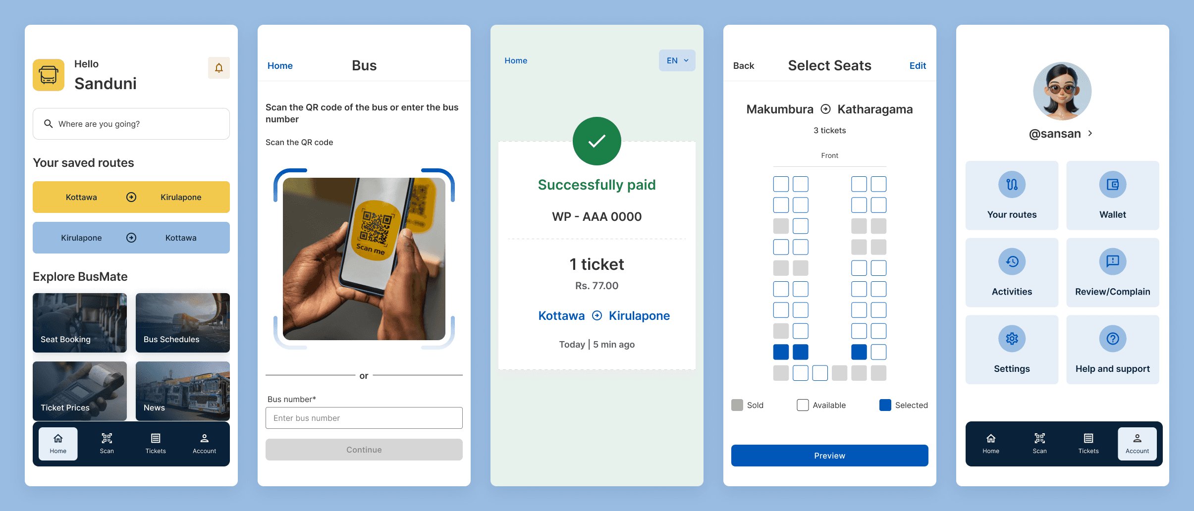
Passenger App:
Scan bus QR codes/enter bus number to pay instantly.
Save favourite routes
Book seats in advance (if available).
View real-time schedules.
Submit complaints.
Accessible payment via wallet or linked bank account.
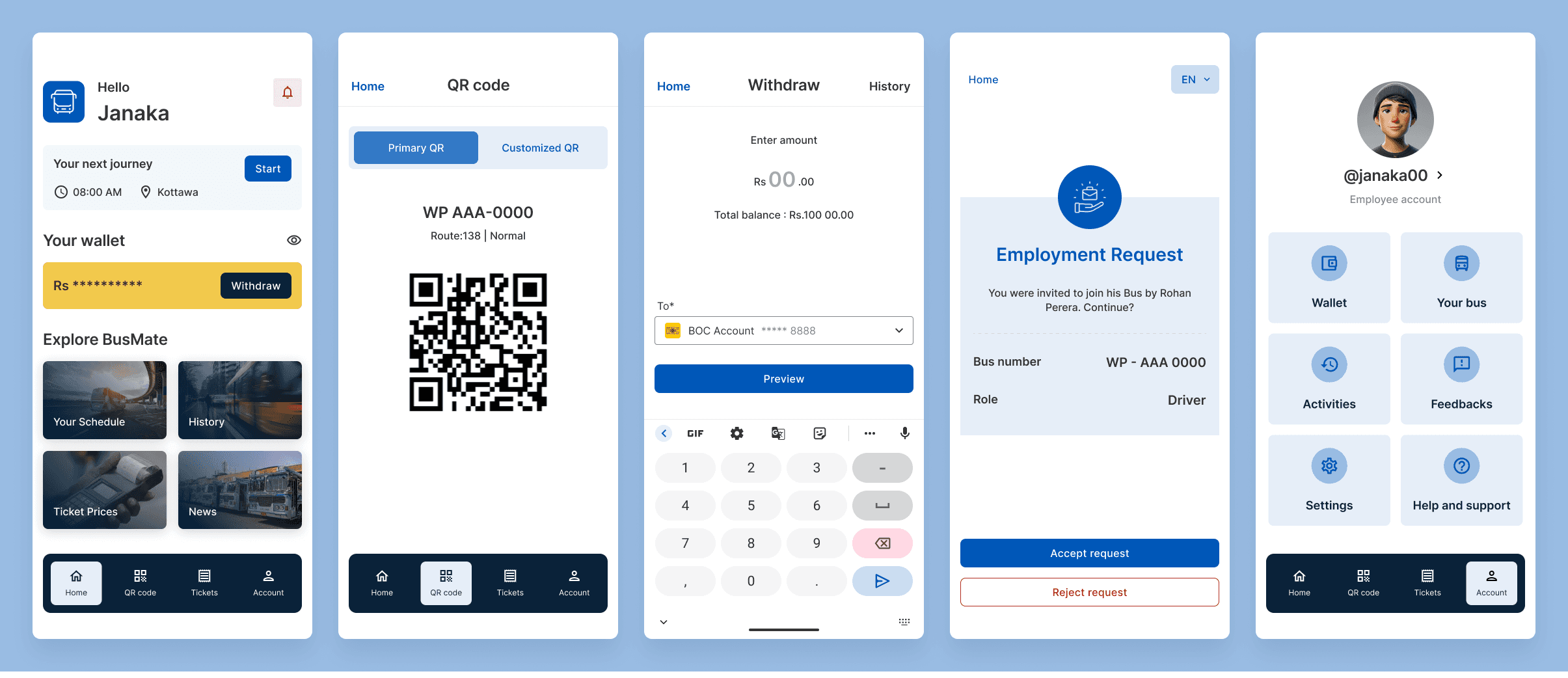
Driver/Conductor App:
Generate trip-specific QR codes for passengers who need assistance.
View passenger payment data.
Mark arrival/departure times.
Provide support for passenger complaints.
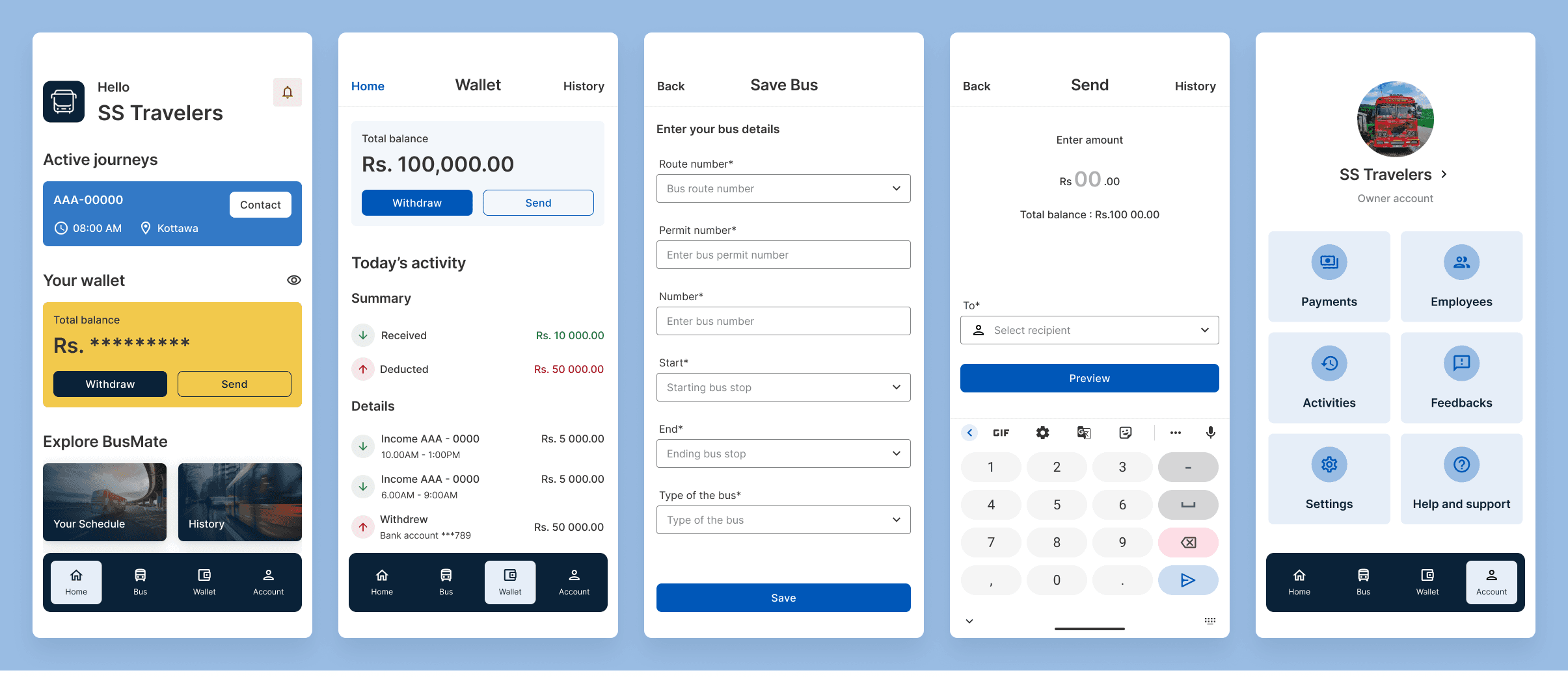
Owner App:
View daily/weekly/monthly revenue.
Track bus operations and feedback.
Manage drivers and bus data.
Key design decisions
Color Palette
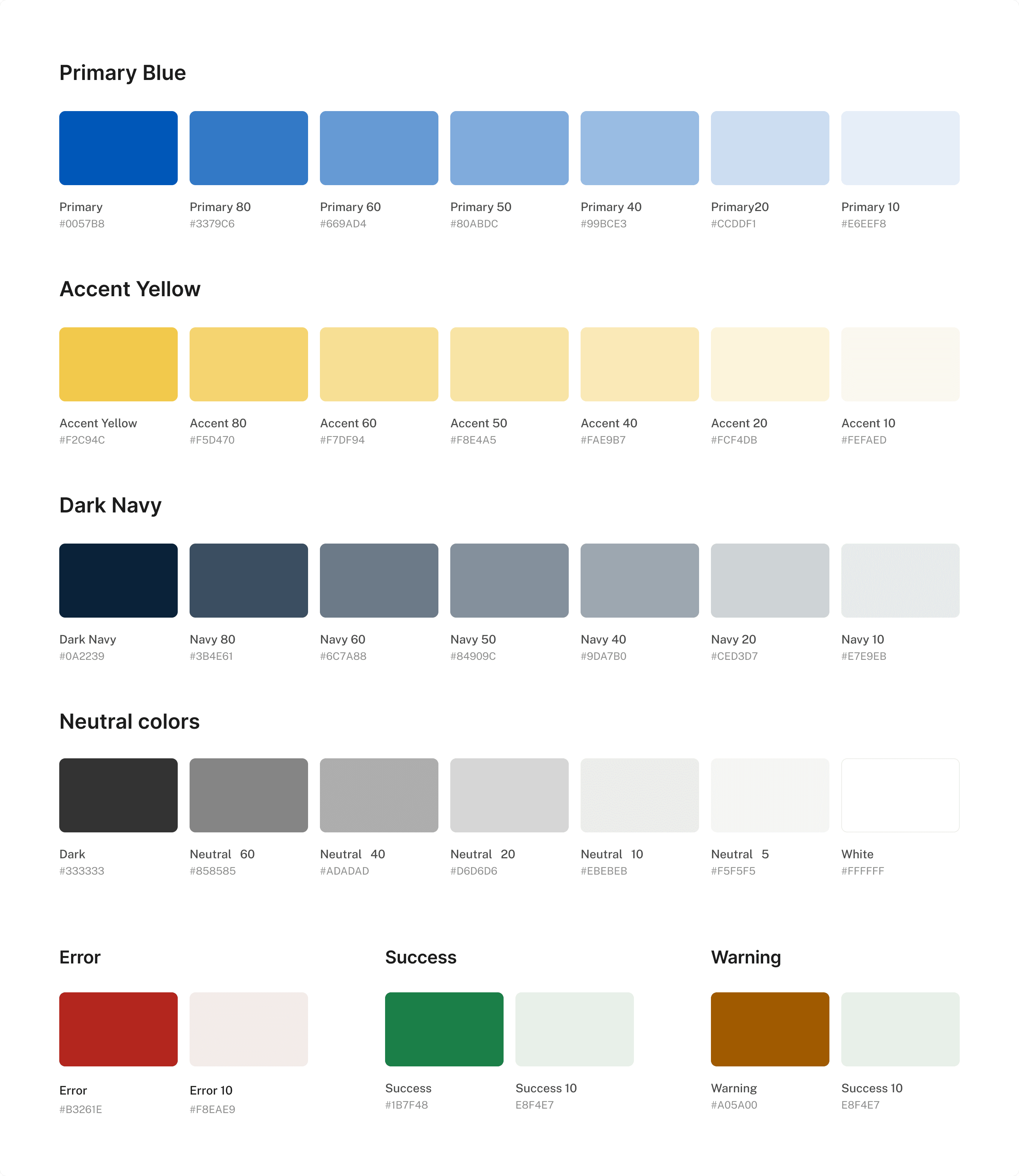
The colour palette for BusMate is designed to be professional, trustworthy, and visually appealing, ensuring clear communication and a pleasant user experience. It incorporates a primary blue, an accent yellow, a dark navy, and a range of neutral tones, along with specific colours for error, success, and warning states.
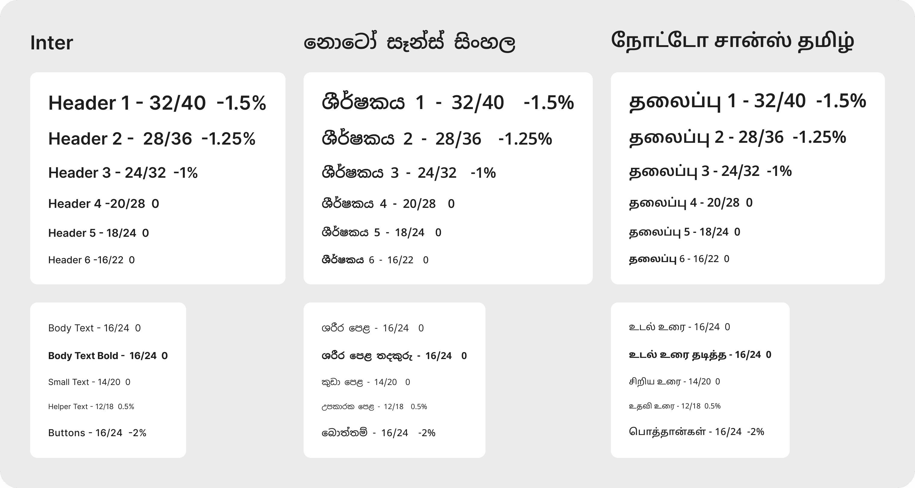
Typography
A robust typography system was developed to ensure clear visual hierarchy and optimal readability across multiple languages. Inter was selected as the primary typeface for English content, chosen for its exceptional legibility on screens and modern aesthetic. For Sinhala and Tamil content, Noto Sans Sinhala and Noto Sans Tamil were chosen, respectively. These Noto fonts are part of Google's comprehensive font family, designed for global compatibility and visual harmony across diverse scripts, ensuring a consistent and clean look for all users.
Button Design

Buttons are designed for clarity, usability, and a consistent visual identity.
Text Case: Sentence case was consistently chosen for all button labels. This approach promotes readability, feels more natural, and aligns with contemporary UX conventions, making the app's actions immediately understandable.
Corner Radius: A uniform corner radius of 8px has been applied to all interactive buttons. This choice provides a subtle rounding that balances a modern aesthetic with clear tap targets, contributing to a clean and friendly interface.
Action-Oriented Labels: Labels utilise clear, concise action verbs to simplify authentication flows and reduce cognitive load, guiding users efficiently through their tasks.
Challenges & solutions
Challenges
Difficulties using the app (type) while in a moving/crowded bus
Elderly/disabled unable to use the app fully
Solutions
Pre-saved options
Conductor-assisted QR ticketing
Future enhancements
Family account
Real-time GPS tracking for live bus locations.
Features related to season tickets
Contact/message system within the app
Money refunding option
Recruitment feature (To owners and employees)
This project demonstrates a user-centred design approach to solving real-world problems in public transportation, creating a scalable and impactful digital solution.